A brochure remains one of the most versatile instruments for communicating concise information to a targeted audience. Whether designed for digital distribution or professional print, an effective brochure requires clear structure, purposeful content hierarchy, and visual consistency to guide readers through key messages with minimal friction. This guide outlines the essential steps for how to make a brochure, as well as proper tools for brochure making.
What brochure is for and who will read it
A brochure that tries to do too much usually ends up doing nothing well. A single, clear goal makes the content easier to plan and easier for the reader to act on. Common goals include promoting a product or service, providing information about an organization, advertising an event, or educating a specific group of readers such as students or patients.
The audience of your brochure affects the tone (formal or conversational), the reading level, the amount of detail to include, and the design choices. For example, a brochure for students looks and reads very differently from one aimed at healthcare professionals.
How to do a brochure: Step-by-step guide
To make a brochure, start by choosing the right fold for your content and purpose. Next, plan each panel carefully so your message flows logically from cover to call to action. Then create your design with digital tools for precision, and test it on paper to check the layout, readability, and overall impact before finalizing.
Choose the right fold for your brochure
The fold type determines how many panels you have and how the reader moves through the content.
| Fold type | Panels | Best for |
|---|---|---|
| Trifold (letter fold) | 6 panels | Most versatile; works for almost any purpose, fits a standard envelope |
| Bifold (half fold) | 4 panels | Clean, simple; good for a single focused message or event program |
| Z-fold | 6 panels | Sequential storytelling or step-by-step content |
| Gate fold | 4 panels with a reveal | Premium product launches or high-impact presentations |
The trifold is the most commonly used format and the one most people picture when they think of a brochure. If you're not sure which to use, trifold is a reliable default.
Plan what goes on each panel
Map out which information goes in each panel before starting to design, since rearranging content after the layout is set takes much longer than planning it first.
For a trifold brochure, the six panels typically follow this structure:
Front cover: Headline, image, and organization name or logo
Inside left panel: Supporting detail or introduction
Inside center panel: Main content, product or service details, key information
Inside right panel: Additional content, testimonials, or supporting images
Back cover (center when folded): Contact information, address, call to action
Return panel (left when folded): Brief summary or supplementary content
Keep copy short and direct. Each panel should be readable at a glance.
Create brochures with digital tools
Knowing how to set up a brochure depends on which tool you're using. The right one depends on how much design control you need, what software you already have, and whether the brochure is for print or digital use.
| Tool | Best for | Key limitation |
|---|---|---|
| Kimi Docs | Brochures where content and structure are both needed from scratch | Less visual design control than dedicated design tools |
| Microsoft Word | Simple layouts, template-based designs | Limited design flexibility for image-heavy brochures |
| PowerPoint | Slide-based layouts, more visual flexibility than Word | Not designed for print specs; export quality varies |
How to do a brochure online with Kimi Docs
Creating a brochure online usually involves fighting with rigid templates and forcing your text into fixed boxes. Kimi Docs handles both the content and the structure of a brochure in a single step.
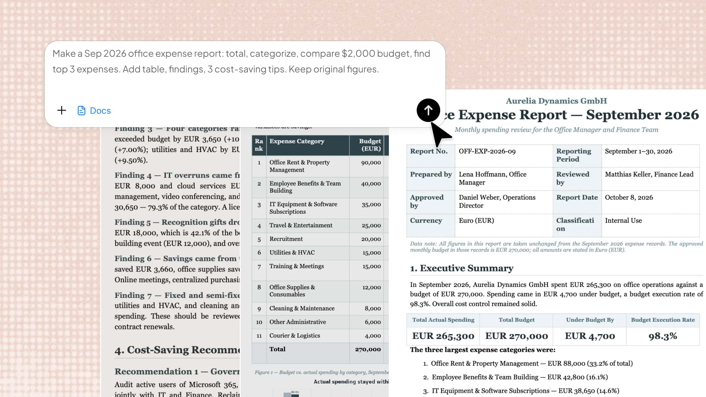
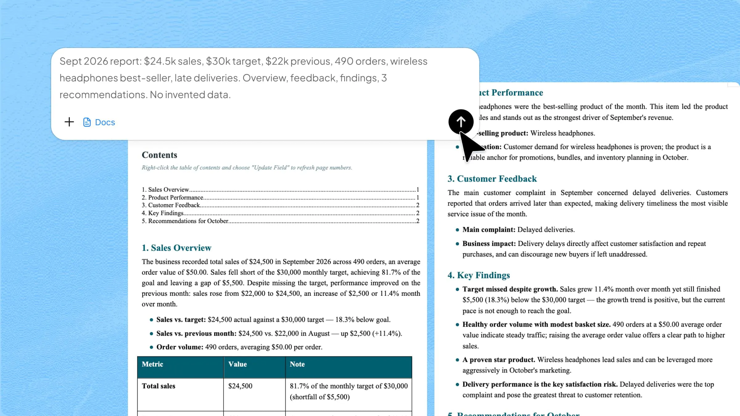
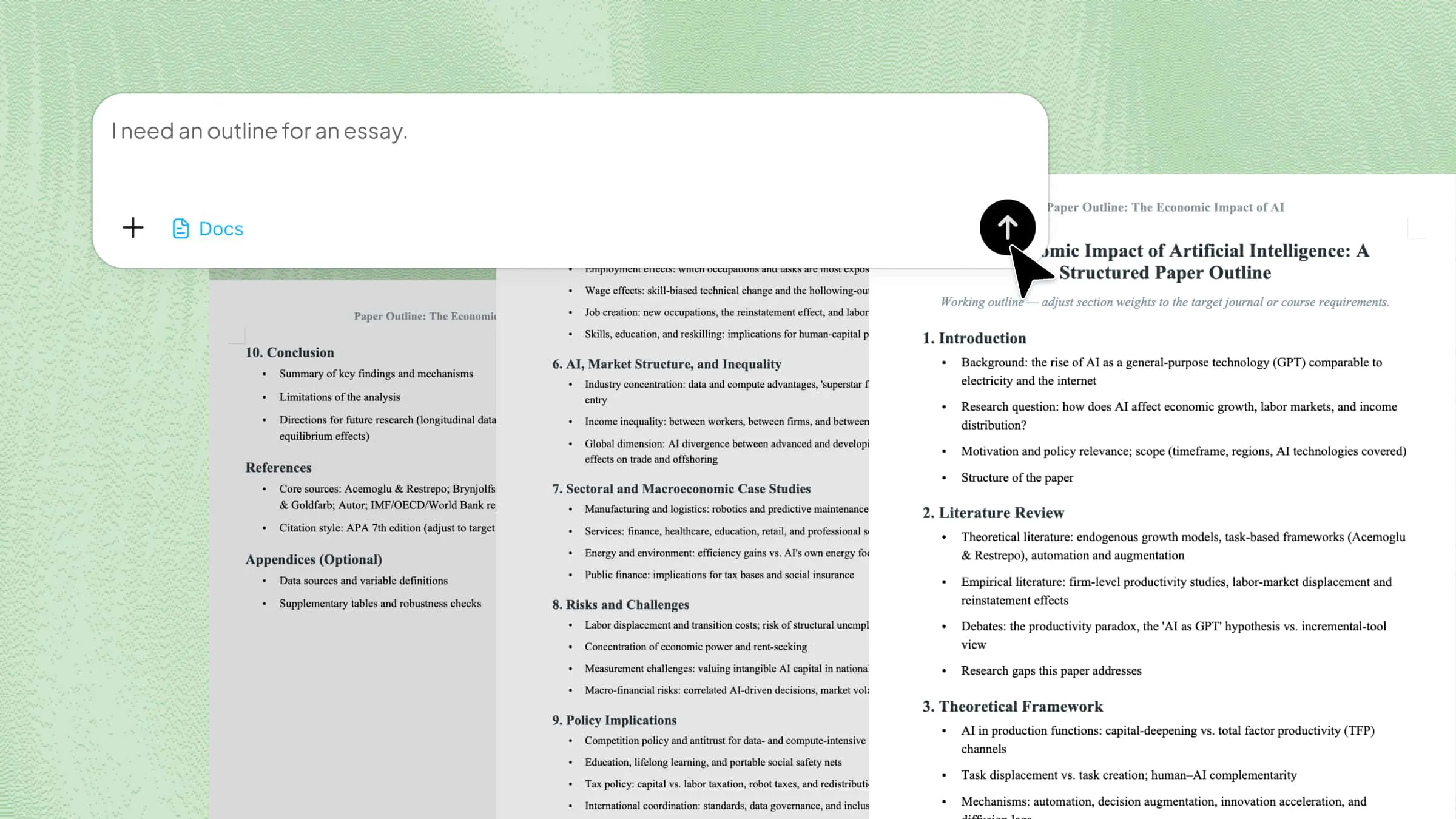
By using Kimi Docs as your AI document agent, you just describe the brochure's purpose, target audience, and panels. It then writes the copy and builds a custom layout around what you actually need to communicate, completely bypassing the need for manual design adjustments.
Step 1: Describe the brochure
Tell Kimi what the brochure is for, who it's aimed at, and what panels it should have.
Step 2: Review and refine
Kimi generates a structured draft. Send follow-up prompts to adjust sections, change the tone, or add more detail to specific panels.
Step 3: Download your brochure
Download the finished document as a Word file or PDF, ready to print or share.
Key features of Kimi Docs
One prompt to polished, complete brochures: Rather than setting up a layout and filling in placeholder text separately, Kimi generates both at once from a description of the brochure's purpose and audience.
Visual design support: Kimi can integrate images and text together, generate professional cover layouts, and include data visualizations or charts where the content calls for them. The result is a brochure that's structured and visually considered from the first draft, not just a text document formatted to look like one.
Adapts to any brochure type: Trifolds, bifolds, event brochures, student pamphlets, and product sheets can all be described and generated the same way.
Adjustable and refinable by prompt: Change a panel's content, shift the tone, or add a call to action with a follow-up prompt instead of editing layout files manually.
Ready to share or print: The downloaded file can be taken into Word or a design tool for final adjustments, converted directly to PDF within Kimi Docs for easy distribution, or sent straight to a print service without any additional software needed.
How to do a brochure on Microsoft Word
You create a brochure in Word using its built-in templates, which is the fastest way to get a finished layout in the software.
Open Word, click "New," and search for "brochure" in the template search box. Select a template, then replace the placeholder text and images with your own content. Adjust fonts and colors to match your brand or purpose.
You can also build a trifold from scratch in Word. Set the page to landscape (Layout > Orientation > Landscape). Go to Layout > Columns and select three columns. Set narrow margins under Layout > Margins > Narrow. Add content to each column section and insert images using Insert > Pictures. When the front side is done, add a new page for the back.
How to do a brochure on PowerPoint
PowerPoint works well for brochures when you need more visual flexibility than Word provides, since its slide-based format is easier to arrange with images and shapes.
Set the slide dimensions to match your brochure size (Design > Slide Size > Custom Slide Size). For a trifold, set the width to 11 inches and the height to 8.5 inches, then divide the slide visually into three equal sections using guide lines. Add your content, images, and design elements to each section. When done, export as PDF (File > Save As > PDF) for the best print quality. The PDF preserves the layout exactly as it appears on screen regardless of the printer or device used to open it.
Lay out a brochure on paper
Take an A4 or letter-size sheet and fold it into thirds lengthwise. This gives you a standard trifold with six panels. Label each panel lightly in pencil: front cover, back cover, and the four inner panels. Sketch the approximate position of text blocks and images in each panel. This rough sketch, called a thumbnail, saves time later because you're planning placement decisions with a physical model rather than guessing on screen.
Tips for creating a brochure that actually works
A well-designed brochure with weak copy doesn't convert. These are the most important writing principles across any brochure type.
Lead with the headline on the cover: The cover headline is the first and sometimes only thing a reader sees. It should say in one short line what the brochure is about and why the reader should care.
Use short paragraphs and bullet points: Brochure panels are small. Dense text blocks get skipped. Break information into scannable chunks.
One main idea per panel: Trying to cover too much in one panel makes each point harder to absorb. Treat each panel like a mini-section with its own clear purpose.
End with a clear call to action: Tell the reader exactly what to do next: visit the website, call this number, attend this event, or use this code. A brochure without a next step is a lost opportunity.
Adapt the tone and language to your audience. A brochure for students reads differently from one aimed at healthcare professionals or potential investors. Match the vocabulary, level of detail, and visual density to whoever will actually pick it up and read it.
Conclusion
Word and PowerPoint cover most everyday brochure needs, but getting to a finished result still means handling the layout, structure, copy, and design decisions yourself. That takes time, especially when you're starting from a blank page. Kimi Docs handles all of it from a single description: the structure, the panel content, and the layout come back as a first draft ready to refine, not a template waiting to be filled in.